· Geographic Paradoxes · 4 min read ·
Cartographic Propaganda: How Maps Were Weaponized to Reshape Reality
Throughout modern history, mapmakers used strategic distortions, emotive symbols, and deceptive projections to persuade minds and advance geopolitical agendas.
Maps command an instinctive level of trust. When observers look at a printed atlas or navigational chart, they generally perceive an objective mathematical reduction of the physical world. Yet behind the measured lines of latitude and shaded contours lies an inherent paradox: every map is an interpretation created by human hands, bound to choices of projection, scale, selection, and graphic emphasis. When cartographers deploy these choices deliberately to influence political opinions rather than convey neutral geography, the result is persuasive cartography, widely known as cartographic propaganda.
The weaponization of maps relies on an audience’s inclination to treat spatial representations as indisputable truth. While written arguments invite scrutiny and debate, geographic diagrams communicate an aura of scientific finality. Governments, military strategists, and ideological movements have exploited this cognitive vulnerability for centuries, designing maps that redraw disputed frontiers, inflate perceived threats, or visually legitimize imperial ambition.
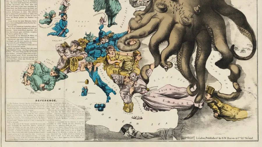
 Figure 1: Fred W. Rose’s satirical 1877 serio-comic war map depicting the Russian Empire as a predatory octopus grasping across Europe and Central Asia.
Visual metaphors and animal iconography
One of the most potent strategies of cartographic propaganda emerged in late nineteenth-century Europe with the rise of serio-comic pictorial maps. Instead of relying on abstract boundaries, illustrators transformed sovereign territories into living creatures, personifications, and predatory monsters. In 1877, British artist Fred W. Rose published his landmark war map in London, personifying the Russian Empire as an enormous octopus stretching black tentacles across the Balkans, Scandinavia, and Ottoman lands.
The cephalopod metaphor became an enduring visual shorthand across political divides. By casting a rival state as an invasive, tentacled creature, mapmakers bypassed rational geographic evaluation, directly triggering instinctual fear and revulsion in viewers. During the First World War, French illustrator Maurice Neumont revived the exact same iconography, recasting Imperial Germany as a spiked-helmet octopus strangling continental Europe. In each case, cartographic geometry was subsumed into emotional persuasion, transforming territorial competition into an existential defense against a monstrous predator.
 Figure 2: Maurice Neumont’s 1917 French propaganda poster repurposing the cephalopod motif to characterize Prussian militarism during the First World War.
Strategic projections and geographic distortion
Beyond explicit caricatures, persuasive cartographers manipulate mathematical mechanics to mislead subtly. Every flat map must distort the spherical surface of the Earth, forcing a compromise between shape, area, distance, or direction. By carefully choosing or altering these projections, cartographers can visually exaggerate the physical dominance of allied powers or minimize the territory of rivals.
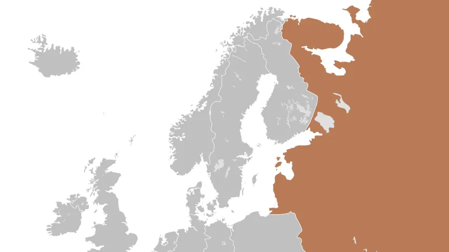
During the Cold War, Western and Eastern illustrators exploited polar azimuthal projections to dramatic effect. By centering the map on the North Pole rather than the equator, American illustrators depicted the Soviet Union as a menacing red landmass looming directly over North America across a narrow Arctic passage. Conversely, Soviet cartographers frequently altered topological proportions, shifted transport corridors, or deliberately omitted entire industrial cities from public maps to frustrate foreign intelligence gathering and project domestic invulnerability.
 Figure 3: An 1899 American political cartoon map celebrating territorial expansion from Puerto Rico to the Philippines under the slogan “Ten Thousand Miles From Tip to Tip.”
The enduring paradox of persuasive cartography
The power of persuasive maps endures because the boundary between functional cartography and political argument remains porous. Cartographers like J.B. Harley noted that maps are an industry packaging spatial knowledge, inevitably reflecting the power structures that fund their production. National borders, disputed islands, and controversial place names are continually negotiated on paper and digital screens long before they are resolved on the ground.
In an era of satellite imagery and digital navigation, the vulnerability to spatial manipulation has expanded into algorithmically tailored maps and dynamic data visualizations. Whether through dramatic pictorial monsters or understated shifts in territorial color schemes, cartography remains an active instrument of statecraft. Recognizing the subjective choices behind every neat coastline and solid border turns map reading from passive observation into critical political investigation.